Skip to content

Document Header

The Ins and Outs of Webcomics, comic page. "Layouts" Four panels where Jey starts off far away and gradually gets closer until their hands are pressed up against the panel. As they get closer they say "This is a very important part of comics-- and the panel choices you make-- can change-- the reading experience!" "Simple layouts are easier to read than complex ones. Don't make reading a chore." Jey is giving a thumbs up beside a simple, easy to read comic page where the eye zig zags through the panels with ease. Jey is dizzy and shrugging confused beside a complex comic page where the eye isn't sure which panel comes next. "It's okay to reuse layouts. Don't feel like you have to do something new every. single. page." Three comic layout examples are shown, and then the same three layouts are shown below just in a different order. "Use gutters to your advantage to establish pacing and time." A panel of a sunny day, with a big gutter between it and a smaller panel with a light to dark gradient, another big gutter, and a panel with the moon and stars in the night sky.

Ins and Outs of Webcomics REMASTER – 4

Ins and Outs of Webcomics REMASTER – 4 published on No Comments on Ins and Outs of Webcomics REMASTER – 4

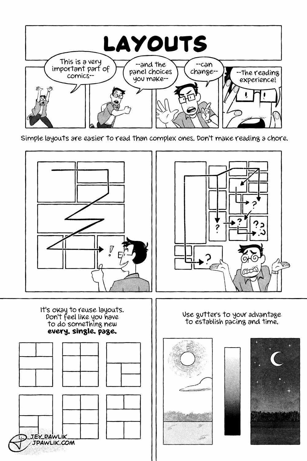
Page 4, let’s talk layouts! I always struggle with big artsy layouts. Where is my eye supposed to go? Sometimes simple is better.

Want to buy a digital or physical copy? Check out the Topaz Comics Shop!

Or you can also grab the PDF on Patreon or itch.io

Want to see sketches, thumbnails, and comic pages early? Join us on Patreon!

Leave a Reply

Your email address will not be published. Required fields are marked *